What Every Restaurant Website Needs in 2026 to Turn Visitors Into Customers
Most restaurant websites look fine. That's the problem. Here's what your site actually needs in 2026 to turn visitors into orders, reservations, and repeat guests.
Michael Westhafer
4/11/20265 min read

Your Restaurant Website Is Not a Brochure. Stop Building It Like One.
I look at restaurant websites every single day.
And I can tell you — the majority of them have the same problem. Not a design problem. Not a technology problem.
A mindset problem.
Somewhere along the way, operators got sold on the idea that a website is a digital version of a take-out menu. You put your hours up there. You drop in a PDF of your menu. You add a few photos. Maybe a contact page. Done.
And then you wonder why it is not doing anything.
Here is the thing nobody tells you. A website is not a brochure. A brochure sits on a rack and waits to be picked up. A website is active 24 hours a day. Someone is hitting your site right now, while you are reading this and either becoming a customer or leaving to find someone else.
The question is not whether your website looks good. The question is what it does.
In 2026, here is what it needs to do.
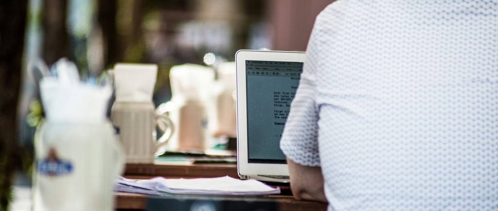
It Needs to Work on a Phone
Seventy percent of restaurant searches happen on a phone. Not a desktop. Not a laptop. A phone. Someone is on their lunch break, or driving past your area, or sitting on the couch trying to figure out where to eat Saturday night.
They pull out their phone and look you up.
What they find is either an experience that pulls them in or one that sends them somewhere else.
If your site loads slow, they leave.
If the menu is a PDF that takes five seconds to open, they leave.
If the buttons are too small to tap without zooming in, they leave.
None of that is their fault. All of it is fixable. But you have to care enough to test it.
Pull up your own website on your phone right now. Not as the owner. As a guest who found you for the first time. Try to figure out your hours. Try to find your menu. Try to place an order.
If any part of that process is frustrating, that frustration is costing you money every day.
It Needs One Clear Action at the Top
When a guest hits your homepage, they should not have to decide what to do next. You should decide for them.
If you run a takeout or fast casual concept, the Order Now button should be the first thing they see. Not in the navigation. Not at the bottom of the page. At the top. Where their eyes go first.
If you are a dine-in restaurant, that button says Make a Reservation. Same placement. Same logic.
I see operators bury this stuff. The call to action is a small link in the menu bar. Or it sends the guest to a third-party platform where they get distracted and end up ordering from someone else.
Your website should be engineered around one goal. Every element on that page should be pushing the guest toward the same action. That is what turns a visit into revenue.
It Needs to Capture Emails
This is the one I feel most strongly about.
Right now, guests are hitting your site every day. They look at your menu. Maybe they plan to come in next week. And then they close the tab.
You do not know they were there. You have no way to reach them. That visit is gone.
An email capture changes the entire equation.
It does not have to be complicated. You are not running a software company. You are running a restaurant. The offer can be simple. Join our VIP list. Get early access to specials. Be the first to know about new menu items.
People will opt in. And when they do, you have something nobody can take from you. A direct line to a guest who already expressed interest in your restaurant.
No algorithm controls whether they see your message. No platform takes a cut. You send an email and it lands.
I have watched operators send one well-timed email to a list of a few hundred people and generate a dinner rush. Not because they had some sophisticated marketing strategy. Because they had a list and they used it.
But it starts here. On the website. If you are not capturing emails, you are leaving your biggest marketing asset on the table.
It Needs Chat
Guests do not want to call you as much as they used to. That is just the reality of where consumer behavior is.
A first-time guest curious about your private dining space is not necessarily ready to dial. Someone with a quick question about an allergy does not want to wait on hold. A person browsing your menu at 11pm wants an answer, not a voicemail.
A chat widget on your site solves all of that.
It lowers the barrier to contact. And the lower the barrier to contact, the more contacts you get. More contacts means more orders, more bookings, more events. That math is not complicated.
What I hear from operators is that they worry they cannot be responsive enough to make it worth it. The truth is you do not have to answer immediately. You just have to answer. A guest who messages you and hears back within a few hours is still a guest you almost lost who came back.
Make it easy for them to reach you. That is the whole idea.
It Needs to Show Your Reviews
Your reviews are probably the most powerful message you have. And most operators leave them sitting on Google or Yelp where a guest would have to go looking for them on purpose.
That is backwards.
The new guest, the one who does not know you yet, is making a decision based on trust. They are asking themselves whether your restaurant is worth trying. Your regulars have already answered that question. Their words are sitting in a review and doing nothing.
Pull those reviews onto your homepage. Let a first-time visitor see what your people say about you before they even click to your menu. That social proof removes doubt. It builds the kind of trust that a clever headline never could.
And it works passively. Your reviews are closing guests for you while you are in the middle of a lunch rush.
It Needs to Connect to a Follow-Up System
This is where most restaurant websites stop. And stopping here is the most expensive mistake operators make.
A website without a follow-up system is like a host who seats a guest, takes their drink order, and then disappears. The guest had a great first impression. They meant to come back. But life got in the way and six months passed.
What would have kept them connected? A simple follow-up. An email that showed up in their inbox two weeks later with something worth clicking on.
You do not need a complicated marketing department to do this. You need a list and a plan to use it. One email a month to people who already like your restaurant. One a week is even better. That is enough to keep you top of mind when they are deciding where to eat on a weeknight.
The website is the beginning of the relationship. It is not supposed to be the whole thing.
Here Is the Real Standard
I will leave you with this.
Your website should be able to answer three questions for a first-time visitor in under thirty seconds.
What is this place? Can I order or book right now? Why should I choose you over the other five options Google showed me?
If it cannot do all three of those things, clearly and quickly, on a phone, it is not working.
The good news is that none of this is complicated. The technology exists. The systems are not expensive. And once you set it up correctly, it runs for you whether you are there or not.
That is the difference between a brochure and a real marketing asset. Build the asset.
If your website isn't doing all of these, I can review it with you and give you a plant to get it there.
Michael, Restaurant Rebellion (michael@restaurantrebellion.com)

We help independent restaurant owners compete and win against corporate chains with the websites, marketing tools, and AI strategy to get found and chosen online.
About Restaurant Rebellion
Contact